Client Brand Design
Tethys Geologic

Back Story

I was introduced to this client through a mutual friend. The company is a geologic consulting firm in oil and gas industry with specific expertise in terrain analysis which they in turn provide to drilling companies.


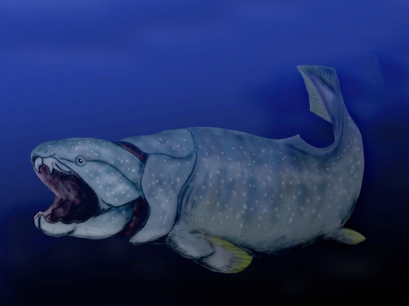
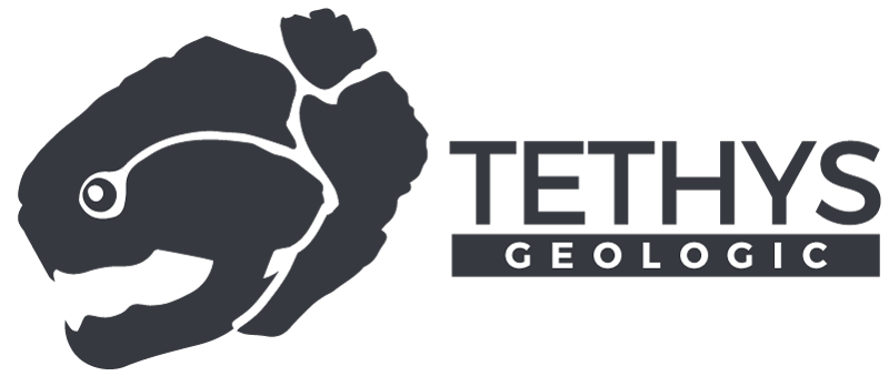
The name 'Tethys' made reference to the Tethys Ocean which existed during the Mesozoic era. This in turn, led me to what sort of logo mark the client wanted: a placoderm, specifically a Dunkleosteus, which is a kind of prehistoric predator fish.

References

Other Brands

AIPC
  • Abstract logo
  • Use of reflection and fade
  • Simple colors
Brara Geologic Consulting
  • Simple colors
  • Reference to industry
  • Simplistic shadows
Dolan Integration Group
  • Reference to compass
  • Dull colors
  • Refers to digging

The problem with most of these logos, is that they are simple and unimaginative. They suggest big companies with lots of people of little energy. They don't evoke emotion that suggests agility and youth.

Energizing the Existing

In order to attract attention, this Tethys Geologic's logo must be grab by not referencing stereoypical shapes associated with the oil and gas industry or geology. Instead, the logo must show the values they stand for: small, agile group who provide tier one worthy information.

Initial Ideas

At first I tried using 'Tethys' to show various text-clipped images associated with the earth plus 2 solid color options.

Moving away from image clipped text, I looked towards placoderms and their heads. Here is the evolution of the art I came up with.

Final Result